What Would an Indexed Universal Life (IUL) Policy Have Earned Over the Last 30 Years? Capped vs. Uncapped
Updated:

An IUL illustration shows your policy growing at one rate, the same every year. In our article on an IUL's illustrated rate and its real growth rate, we worked out what that rate actually comes to after the charges: its IRR. But the market never pays the same rate two years running. So this article asks a different question: what IRR would the policy have earned if it had been bought 30 years ago and credited from the S&P 500 as it actually moved?
We use the same real illustration as in how much an IUL costs, for a 30-year-old man who does not smoke, with about $101,000 of premiums paid over the first 4 years. It offers two index accounts on the S&P 500, and we run both.
Cap vs. spread: how do an IUL's capped and uncapped accounts differ?
Both accounts credit nothing in a year the index falls — a 0% floor — and both use 100% participation. They differ in how they limit a good year:
- The capped account credits the index's rise up to a 10.5% cap. A year the index rises 25% credits 10.5%.
- The uncapped account has no cap. Instead it subtracts a 5.5% spread from the index's rise. A year the index rises 25% credits 19.5%; a year it rises 4% credits nothing.
These are the terms the illustration prints today, and neither is guaranteed: the contract lets the carrier lower the cap to as little as 4% and raise the spread to as much as 20%. We hold today's terms fixed throughout.
Our guide to understanding IUL used this same pair as its example of a cap set against a spread. Which one does better depends on the market, so here we run both through the market that actually happened.
What 1996 to 2025 would have earned
We credited each account from the S&P 500's actual price change in each year from 1996 to 2025. That is the index's price only, without its dividends, because the price is what the policy's crediting follows. The premiums, and the charges at the rates the illustration prints, are the illustration's own.
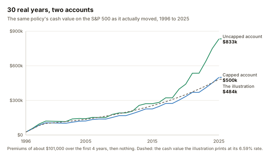
As shown above, after 30 years:
| Cash value at year 30 | IRR | |
|---|---|---|
| The illustration's own projection, 6.59% every year | about $484,000 | about 5.6% |
| Capped account, real 1996–2025 | about $500,000 | about 5.7% |
| Uncapped account, real 1996–2025 | about $833,000 | about 7.6% |
The capped account ended almost exactly where the illustration said it would. The uncapped account ended about two-thirds higher than the capped one — and for its first 15 years or so, the two were never far apart.
Why did the uncapped account earn so much more than the capped one?
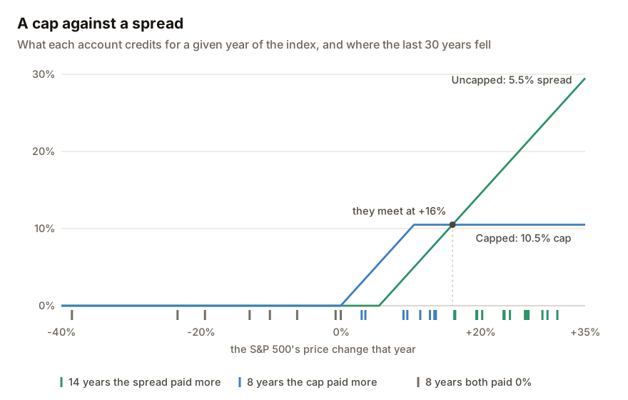
Because the spread's wins were far bigger than the cap's. In a year the cap pays more, it beats a 5.5% spread by 5.5 points at most; in a year the spread pays more, its lead has no limit, and 14 of the 30 years from 1996 to 2025 rose enough for the spread to pay more.
The two lines in the chart above meet where the index rises 16%. There, a 10.5% cap and a 5.5% spread both credit 10.5%. Below a 16% rise the cap pays more; above it, the spread does. In a year the index falls, both pay 0%.
So which account wins depends on how many years land above 16%. Of the 30 years from 1996 to 2025:
- 14 rose more than 16%, and the uncapped account credited more;
- 8 rose less than that, and the capped account credited more;
- 8 fell or stood still, and both credited 0%.
The two sides of that trade are not the same size. The most the cap can beat the spread by in any year is 5.5 points — the size of the spread itself. The most the spread can beat the cap by has no limit. In 1997 the index rose 31%: the capped account credited 10.5% and the uncapped account 25.5%, a difference of 15 points in one year.
When the strong years land matters too. This policy's premiums were all paid by 1999, and by 2012 the uncapped account held about $207,000. The strong years after that — 2013, 2017, 2019, 2020, 2021, 2023, 2024 and 2025, each a rise of more than 16% — added their extra credit to a balance that size and larger. That is why the gap in the first chart opens after about 2012 rather than at the start.
Was 1996 to 2025 a lucky stretch?
Any single 30 years could be. So we ran the same policy through every 30-year stretch of S&P 500 history we hold, from 1946–1975 to 1996–2025: 51 stretches in all, with today's cap and spread applied to every year.
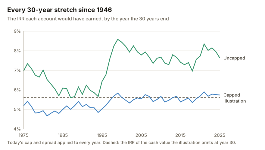
As shown above:
- Capped account: between about 4.7% and 5.9%, with a median of about 5.4%. It matched or beat the illustration's own 5.6% in 13 of the 51 stretches.
- Uncapped account: between about 5.6% and 8.6%, with a median of about 7.4%. It matched or beat the illustration's 5.6% in 50 of the 51.
- The uncapped account earned more than the capped account in all 51.
That follows from the chart before it. Across the 80 years from 1946 to 2025, the index rose more than 16% in 30 of them — often enough that the side of the trade with no limit won every stretch.
One assumption sits under this chart. We applied today's 10.5% cap and 5.5% spread to every year back to 1946, and neither is guaranteed. The chart shows how this contract, with the terms it has today, would have handled each stretch of real history. It is not what a policy bought in 1946 would actually have credited.
So what IRR should you expect from an IUL?
On this policy, held for 30 years with nothing borrowed and credited from real S&P 500 history at today's terms, the capped account would have earned between about 4.7% and 5.9% a year, and the uncapped account between about 5.6% and 8.6%. Over the most recent 30 years, about 5.7% and 7.6%.
To see where your own policy falls, IULCheck.com reads its cap, spread and charges from your illustration and works out the IRR of each account across real S&P 500 history and a range of other markets.
The capped account's range sits around the illustration's own 5.6%. The uncapped account's sits above it in all but one of the stretches we ran. That is a strong result for the uncapped account on this contract. What would change it: a lower cap or a wider spread, which the contract allows; premiums spread over more years rather than paid in the first 4; or a policy bought at an older age, with higher charges for the cost of insurance.
See what your own policy would have earned
Drop your illustration in and we'll run each of its accounts through real S&P 500 history and a range of other markets, and work out the IRR of each — at your policy's own cap, spread and charges.
For the easiest experience, complete your analysis on a computer.
Drop your illustration here
or click to choose a PDF, up to 25MB