Is your IUL worth it? Test it in the markets your illustration skips.
Upload the indexed universal life (IUL) illustration you were given. We rebuild the illustration from the numbers it prints, run the policy through crashes, flat decades and lower crediting terms, and show you what it guarantees and what it doesn’t.
Upload your IUL illustration
Free to upload. No payment required to see what we found.
For the easiest experience, complete your analysis on a computer.
Drop your illustration here
or click to choose a PDF, up to 25MB
Make sure to include the We can’t analyze an illustration without its year-by-year table of policy charges. It’s usually called the Annual Cost Summary or a Policy Charges report, and it’s typically near the very end of the illustration: a table running several pages, one row per year to age 100 or 120. For each year, it lists the premium charge, policy fee, cost of insurance and other charges in dollars.It’s often optional, so the copy you were given may not have it. If not, ask your agent to run the illustration again with it included.Not sure? Upload it anyway, and we’ll let you know if it’s missing..
Rather not send the whole document? You can first, or type the figures in yourself. We read your PDF once, take the figures the analysis needs, and delete the file. What we keep is a table of numbers — premiums, charges, ages, values. Not the document, not your address, not your policy number.
The questions behind every IUL, answered on a real policy.
Each answer below comes from one real illustration we analyzed. Upload yours, and we answer the 4 questions below with the figures your illustration prints.
Question 1
What if my policy earns less than the rate on my illustration?
The rate printed on an illustration is an assumption. Here is how far it can be from what the money actually earns.
6.59%
The crediting rate the illustration assumes
5.9%
The IRR of the premiums against the year-40 cash value, both as the illustration prints them
One real illustration, a 30-year-old who does not smoke.
The printed rate is not your growth rate
On one real illustration, the rate on the front page is 6.59%. Put the premiums and the year-40 cash value printed on that illustration into an IRR, and the money grows at about 5.9% a year. The difference is mostly what the charges take out.
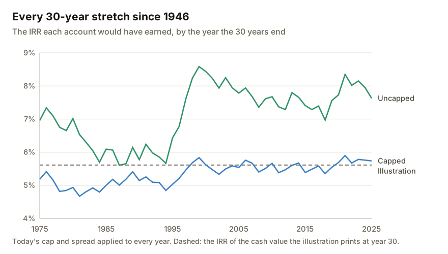
We applied the current cap and spread of the policy we analyzed to every 30-year stretch of the S&P 500 since 1946. The capped account earned between 4.7% and 5.9% a year, and the uncapped account between 5.6% and 8.6%.
Crediting terms held halfway to their guaranteed minimums
Early and late
Two placements, because when it happens changes the result
A stress test, not a forecast of what the carrier will do.
Lower crediting terms, tested on your own policy
A carrier can lower the cap or raise the spread, within limits the contract sets. We move your policy's crediting terms halfway to their guaranteed minimums for 10 years, early and then late, and run it through every market we test, slow-growing and flat ones included. You see how much cash value the lower terms cost.
Typed in from your illustration, yours to changeFormulas
Try 4% or 3% yourself, in the spreadsheet
The report comes with a spreadsheet that rebuilds your illustration with formulas. The credited rate is typed into every year, so you can set it to 4% or 3%, for every year or for one, and watch the cash value and the death benefit recalculate.
What you would receive depends on the year, and taking money out does not have to mean ending the policy.
Surrender value, as a share of the premiums paid so far
Year 1
59%
Year 2
77%
Year 3
86%
Year 4
92%
Year 5
98%
Year 6
104%
What you paid in
One real illustration, at its illustrated 6.59% rate.
What surrendering returns, year by year
On the policy we analyzed, surrendering in year 1 would return about 59% of the premium paid. The surrender value does not pass the total premiums paid until year 6, and that assumes the illustrated rate every year. We read the surrender values from your own illustration.
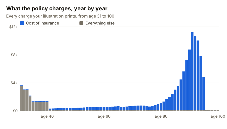
On the policy we analyzed, the heaviest charges come in the first 10 years. After that they are small next to the account, until the cost of insurance climbs from the late 70s. How many of your policy's heavy early years are already paid changes what keeping it costs from now on.
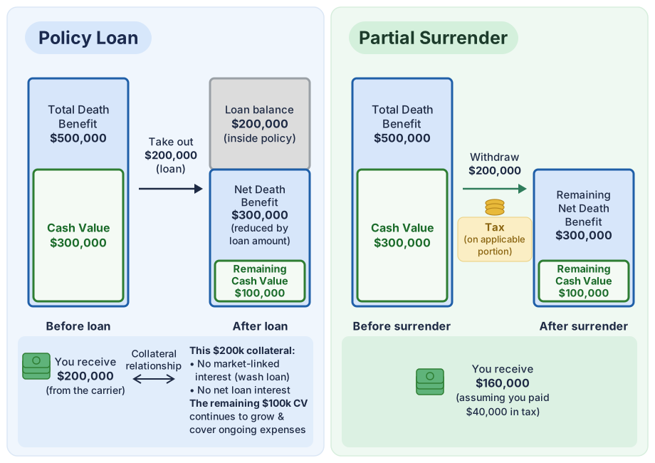
A partial surrender takes money out and may be taxed. A policy loan is borrowed against the cash value, and the policy stays in force. Both lower the death benefit by the amount taken.
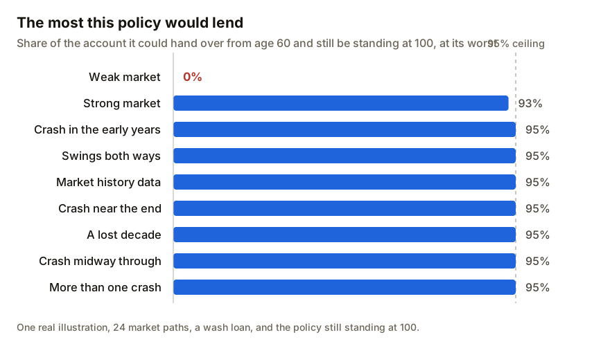
We searched for the largest loan from age 60 that still keeps one real policy in force to 100. In most markets it was 95% of the account, the most the policy allows. In a weak market it was 0%.
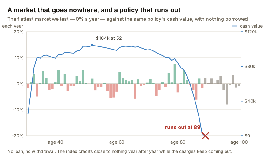
A policy lapses when the cash value can no longer pay the charges. On the policy we analyzed, a crash did not empty the cash value, but a long flat market did.
A flat market, and no loan at all
In the flattest market we tested, the index credited close to nothing year after year while the charges kept coming out. With nothing borrowed, the cash value reached zero at age 89.
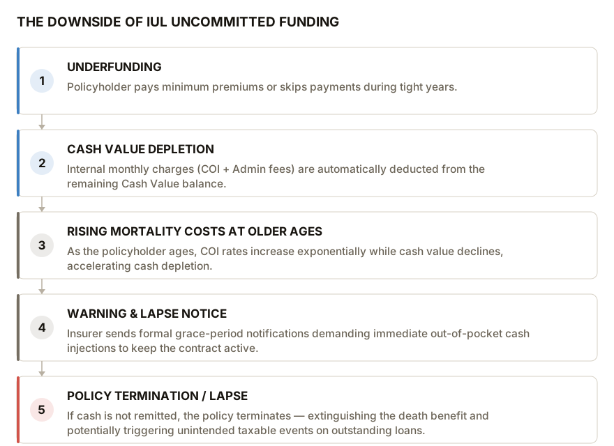
An IUL lets you pay less in a tight year. The charges still come out of the cash value every month, and the cost of insurance rises with age, so a policy funded near the minimum can run out.
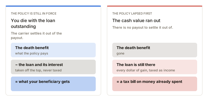
If the policy is in force when you die, the loan is paid out of the death benefit and is never taxed. If it lapses first, there is no death benefit, and the gain you borrowed is taxed as income.
Would I do better buying term and investing the rest?
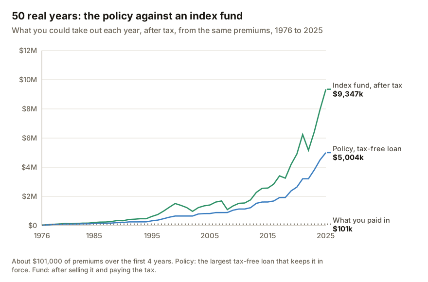
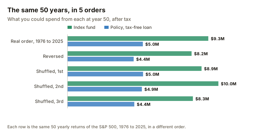
We put one real policy against an S&P 500 index fund on the same premiums, after every fee and tax. Investing came out ahead, and the policy did some things the fund cannot.
50 real years, the policy against an index fund
On the same premiums from 1976 to 2025, you could take out about $9.3 million after tax from the index fund and about $5.0 million from the policy. The two stayed close for the first 15 years.
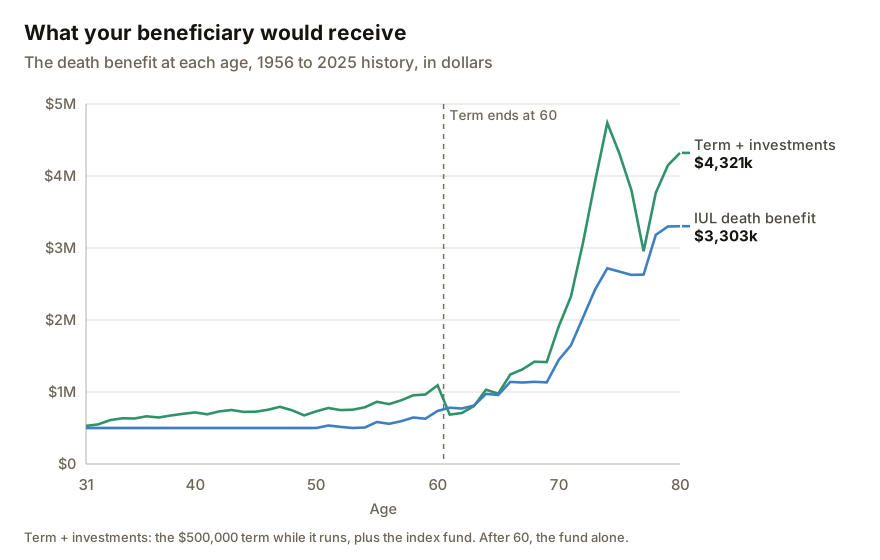
Against a $500,000 term policy plus an S&P 500 index fund, the term plan paid more at most ages. The IUL paid more just after the term ended at 60, and again after the 2008 fall.
How long the death benefit lasts while the policy is in force
On one real policy. Your own illustration may differ.
What the policy did better
3 things held up in our tests. The floor credited nothing instead of a loss in every crash we ran. The loans were tax-free and large enough to borrow the most the policy allows in most markets. And the death benefit lasts for life, for as long as the policy stays in force.
An illustration shows one market. We run your policy through all of these.
Each chart is 50 years of one market in our library, one bar per year: green for a year the index rose, red for a year it fell, all on one scale. The rate at the top right is how fast that market grew on average. Your policy is run through every market with the charges, cap, floor and spread your illustration prints.
Real S&P 500 history
9.0% a year
Worst year −38%Best year +34%
The index's own annual price returns for the most recent years, in the order they happened.
Real history, run backwards
9.0% a year
Worst year −38%Best year +34%
The same years in the opposite order.
Strong growth, small swings
10.0% a year
Worst year −5%Best year +31%
10% a year, with small moves from one year to the next.
Strong growth, large swings
10.0% a year
Worst year −38%Best year +83%
10% a year, with large moves up and down.
Weak growth, small swings
2.0% a year
Worst year −15%Best year +24%
2% a year, with small moves from one year to the next.
Weak growth, large swings
2.0% a year
Worst year −43%Best year +65%
2% a year, with large moves up and down.
No growth, small swings
-0.0% a year
Worst year −17%Best year +16%
0% a year, with small moves.
A lost decade
4.8% a year
Worst year −30%Best year +54%
The same 6% market the crashes are built on, except that the first 10 years end where they began, with moderate swings along the way.
A crash in years 4 and 5
4.7% a year
Worst year −25%Best year +54%
A market growing about 6% a year that falls about 40% over two years, then recovers.
A crash in years 24 and 25
4.7% a year
Worst year −25%Best year +54%
The same market and the same fall, twenty years later.
A crash in years 44 and 45
4.7% a year
Worst year −25%Best year +54%
The same market and the same fall, forty years later.
Two crashes
3.4% a year
Worst year −25%Best year +54%
The same market with the same fall in years 4 and 5 and again in years 24 and 25.
The report
Every question in one report, answered with your policy's own figures.
Working through an illustration by hand takes hours. The report goes chapter by chapter, and each chapter answers its questions from your illustration and the markets above.
IULCheck.comReport
Your IUL, chapter by chapter
Contents
1Your policy
2What this policy costs
3How the policy may grow
4Whether the policy stays in force
5How you can access your money: surrender vs. loan
6How the tax treatment works
7What's actually guaranteed
8How it compares with investing yourself
9What protection you're actually buying (with a term quote)
10What you asked (when you ask a question)
T8fx=M8*O8
Year
Age
Credited rate
Interest credited
Account value, end
6
1
31
6.59%
=M6*O6
=O6+…+T6
7
2
32
6.59%
=M7*O7
=O7+…+T7
8
3
33
4.00%
=M8*O8
=O8+…+T8
9
4
34
4.00%
=M9*O9
=O9+…+T9
10
5
35
4.00%
=M10*O10
=O10+…+T10
Typed in from your illustration, yours to changeFormulas
And a spreadsheet with the formulas
Every year’s credited rate is typed in at the rate your illustration assumes. Change it to 4% or 3%, in every year or in one, and the interest, the cash value and the death benefit recalculate.
How it works
See what we found before you decide.
1
Upload your illustration
The PDF you were given. Take out your name and policy number first if you like.
2
Check what we read
We take the figures from your illustration and rerun its calculations to within 5%. You can correct anything we got wrong.
3
See what we found
A preview of the findings is free. You decide afterward whether you want the full report.